Light
Dark
Rackbeat
Date
Category
Web & Identity
Client
Rackbeat
Project Duration
4 weeks
Project Role
UI & IdentityDesigner


Warehouse inventory management
Rackbeat offers cloud-based inventory management that brings stock, purchasing, orders and production together in one system. It makes businesses’ daily work more efficient and ensures they never run low or out of stock on key items.


The challenge
As Rackbeat’s customer base grew to more than 2,500 businesses, the brand needed to keep pace: a clean, modern identity that communicates innovation in digital warehouse management and holds its own against larger competitors.


The concept
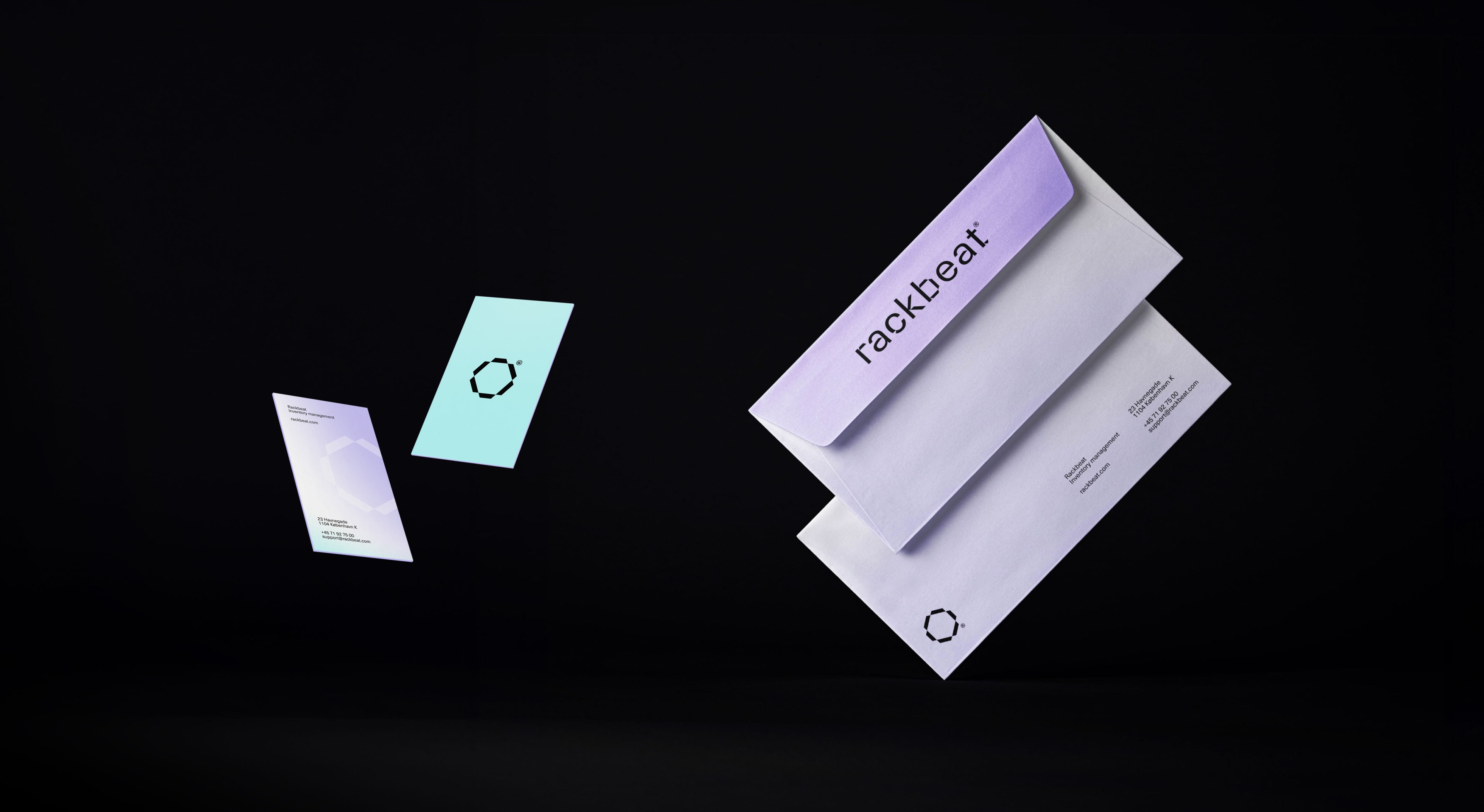
I developed a conceptual identity as a pitch, built on the tension between the two sides of Rackbeat’s business: the physical, industrial world of the warehouse and the digital, technical nature of the product.
Logo evolution. A refined take on the existing logo, keeping its recognisability while making it sharper and more contemporary.
Colour and imagery. A palette and image style that combine industrial grounding with digital clarity.
Typography. A clean grotesque typeface, manipulated to create a custom version that gives the brand extra character and a bespoke look.
The identity was designed for digital first, prioritising clarity and legibility on screen, from the product interface to marketing channels.


The result
A pitch that showed Rackbeat how its brand could evolve to match its growth: industrial at its core, digital in expression, and distinctive enough to stand out in its sector.